Risk-return scatter plots are a powerful tool for understanding the relationship between risk and return in investment. By constructing and interpreting these plots, investors can gain valuable insights into the risk-return profiles of individual investments, portfolios and asset classes. This knowledge can be used to make more informed investment decisions, construct well-diversified portfolios, and track performance over time.
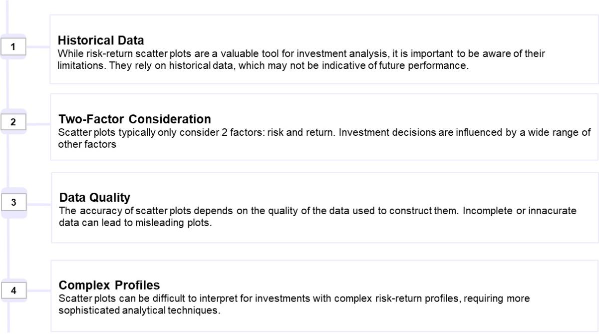
How Do You Measure Risk and Return?
Risk and return are measured using various statistical and financial tools.
1. Return:
- Returns can be calculated using historical data (past performance) or estimated based on future expectations.
- It's important to consider both the magnitude of the return and the time period over which it was earned.
2. Risk:
- Risk is typically assessed using statistical measures like standard deviation and beta, which quantify the volatility of returns.
- Risk is an abstract concept. An economist considers risk to be expressed in a person’s preferences. What one individual perceives as risky may not be perceived as risky by another person. There is a vast literature on this subject. The books of Arrow, Raiffa and Borch are a good introduction.
- Also the MoneySign framework as a tool is also made up for a person to recognise their financial disposition. Its in-depth assessment seeks to understand the way one deals with money — their propensity for risk, how one saves and invests, and so on — which are very important parameters required before planning for investments.
- The standard deviation measures the spread of the distribution above its mean. Investors commonly refer to the standard deviation as the volatility. The variance is the square of the standard deviation.
- Critics of the standard deviation point out that it measures the possibility of returns both above and below the mean. Most investors would define risk as involving small or negative returns (although short sellers have the opposite view).
What is the Basic Rule of Risk and Return?
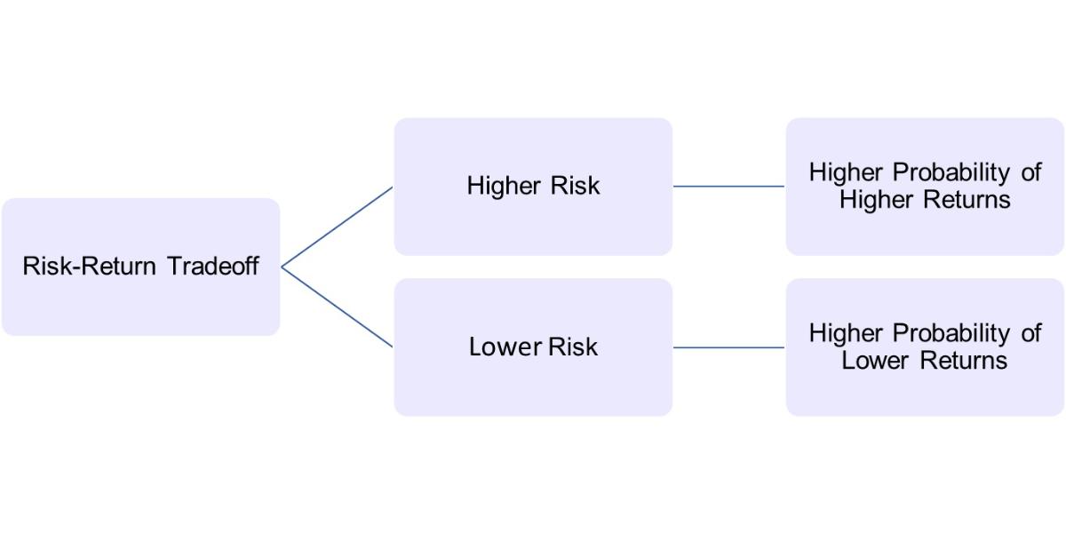
Did you know before Harry Markowitz came up with his Modern Portfolio Theory, individuals largely focused on individual stock picking, trying to find “best stocks”. Diversification was a common idea, but it was more of a general guideline than a rigorous process. By applying his model to historical market data, Markowitz demonstrated that it was possible to construct portfolios that offered a better risk-return trade-off than simply picking individual stocks or using less systematic diversification methods. His work provided a rigorous, quantitative way to approach portfolio construction. That is how individuals started recognising the fact that higher risk comes with extra benefits of higher returns because investors must be compensated if they are taking higher risk.
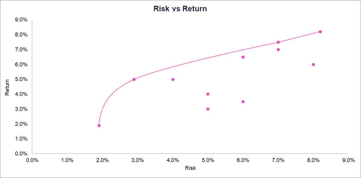
In the above chart, out of two points that give a 5.0% return, one has a risk of 3.0% and the other has a risk of 4.0%. A rational investor would probably choose the lower risk of 3.0 if all other factors were equal. There are also two points with a risk of 6.0%, one of which gives a 3.5% return and the other a 6.5% return. The rational investor would choose the higher return for a given risk so, would prefer the 6.5%. As you go to the left, the risk reduces, and as you go up, the return increases. The line drawn, which represents the range of the best investments considered individually, is called the Efficient Frontier.
Recommended for you
Readers also explored
Positioning Portfolios in FY26: From Macro Trends to Allocation

India’s Unemployment Rate in 2025
Understanding Risk - Return Scatter Plot
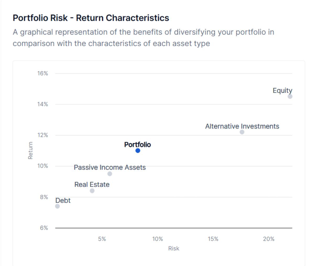
- This scatter plot visually illustrates the risk-return characteristics of each asset class and the overall portfolio. Risk, measured by standard deviation, is plotted on the X-axis, and annualised expected return is on the Y-axis.
- The overall portfolio's risk-return profile, achieved through diversification, is also plotted. This helps investors visualise the benefits of diversification compared to a portfolio concentrated in a single asset class.
- Proximity to the Y-axis (Lower Risk): Asset classes clustered near the Y-axis are considered lower risk. These might include fixed-income or high-quality bonds, offering stability and income but potentially lower growth.
- Distance from the X-axis (Higher Return): Asset classes farther from the X-axis typically offer higher potential returns. These could include equities or real estate, where growth potential is greater, but so is volatility.
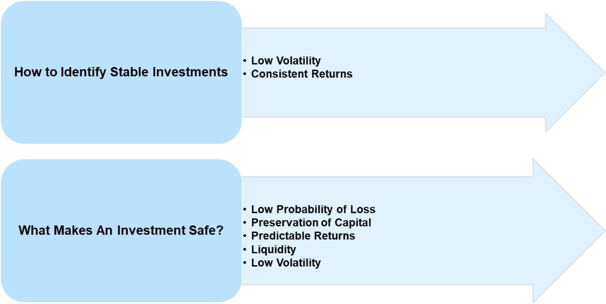
Finding Safe Investments
Which chart areas show safer investments?
Safer investments are found in the lower left portion of the risk-return scatter plot. This area represents asset classes with:
- Lower Risk (closer to the Y-axis): The closer an asset is to the vertical (Return) axis, the lower its historical volatility and, generally, the lower its risk.
- Lower Return (closer to the X-axis bottom): While we want high returns, safer investments typically offer lower potential returns in exchange for reduced risk.
In the provided image, Debt is the asset class that appears to be the safest as it's located closest to the origin. Passive Income Assets also exhibit lower risk and return compared to other assets shown in the chart.
Growth Investment Opportunities
Growth Investment Opportunities & High-Growth Areas on the Chart:
- Where to Find Them: Growth investment opportunities are located in the upper right portion of the risk-return scatter plot. This area signifies assets with the potential for higher returns, but also higher risk.
- On the Chart: In the image, Equity is the asset class that stands out as a high-growth opportunity. It's positioned furthest to the right (high risk) and highest on the chart (high return). Real Estate and Alternative Investments also exhibits a relatively high risk and return profile, making it another potential area for growth investments.
Risks of Growth Investments:
- Volatility: High-growth assets, like equities, can experience significant price swings in short periods. This volatility can be unsettling, triggering fear and panic, which can lead to emotional decision-making. While emotions play a role in all decisions, particularly in finance, it’s often the emotion of fear during market downturns that drives detrimental actions like panic selling.
- Loss of Principal: There's no guarantee of high returns. In fact, high-growth investments carry a greater risk of losing some or all of the invested capital. Companies can fail, and markets can crash.
- Liquidity Risk: Some growth investments, like certain types of real estate or passive income assets, may be less liquid than publicly traded stocks. This can make it difficult to sell the asset quickly if needed.
Analysing Portfolio Performance using Scatter Plots
| Risk-Return Scatter Plots | Assess overall risk-return profile | Comparison to other portfolios |
| Not just for analysing individual investments, risk-return scatter plots can also be used to evaluate the performance of an entire portfolio. | Plotting the risk and return of a portfolio on the scatter plot allows you to assess its overall risk-return profile. | Compare the portfolio to other portfolios or benchmarks using the scatter plot. |
Limitations of Risk-Return Scatter Plots
Achieving Balance and Optimal Allocation
The ideal portfolio doesn't reside solely in one corner of this plot. The goal is to create a strategic mix that capitalises on growth opportunities while mitigating risk through diversification. This involves balancing assets plotted near the y-axis with those farther from the x-axis. The Macro Asset Allocator's recommended portfolio, represented by the distinct marker, aims to find this optimal balance based on the prevailing macroeconomic conditions and the user's profile.
Dynamic Portfolio Management
The scatter plot is not static. As economic phases shift, the positions of asset classes may change. An annual review of your portfolio's position on the plot can guide adjustments to your asset allocation. Is your portfolio aligned to the optimal risk and return? Has the macroeconomic environment altered the risk-return profile of specific asset classes? These insights inform data-driven decisions to maintain or rebalance your portfolio.